Deardeal
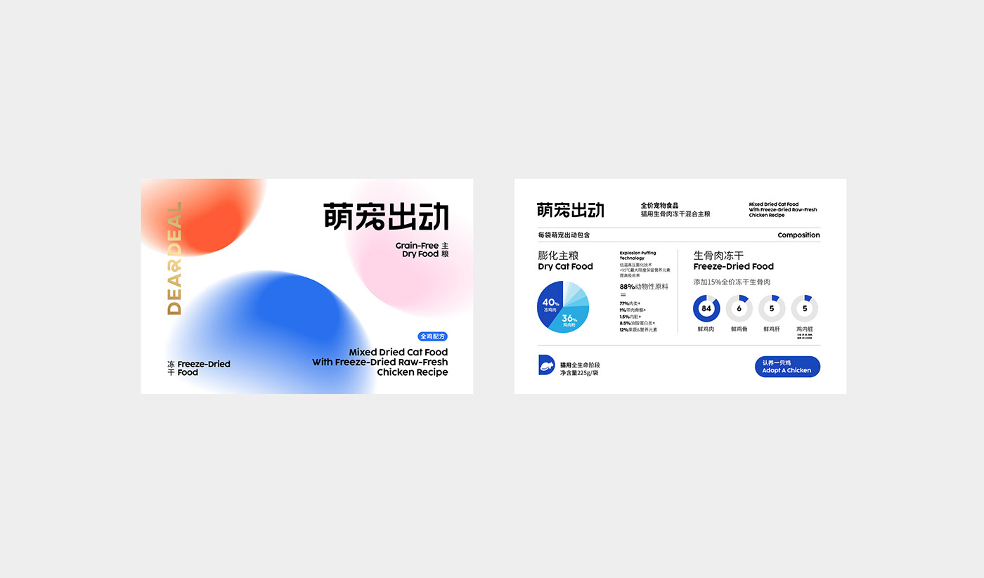
In order to form new-fashionable aesthetics of scientific pet raising, Deardeal integrates youngster’s favourite elements altogether. Comparing with pet food brands on the market, Deardeal pays attention to pet nutrition absorption with brand carefulness and professional product sense.
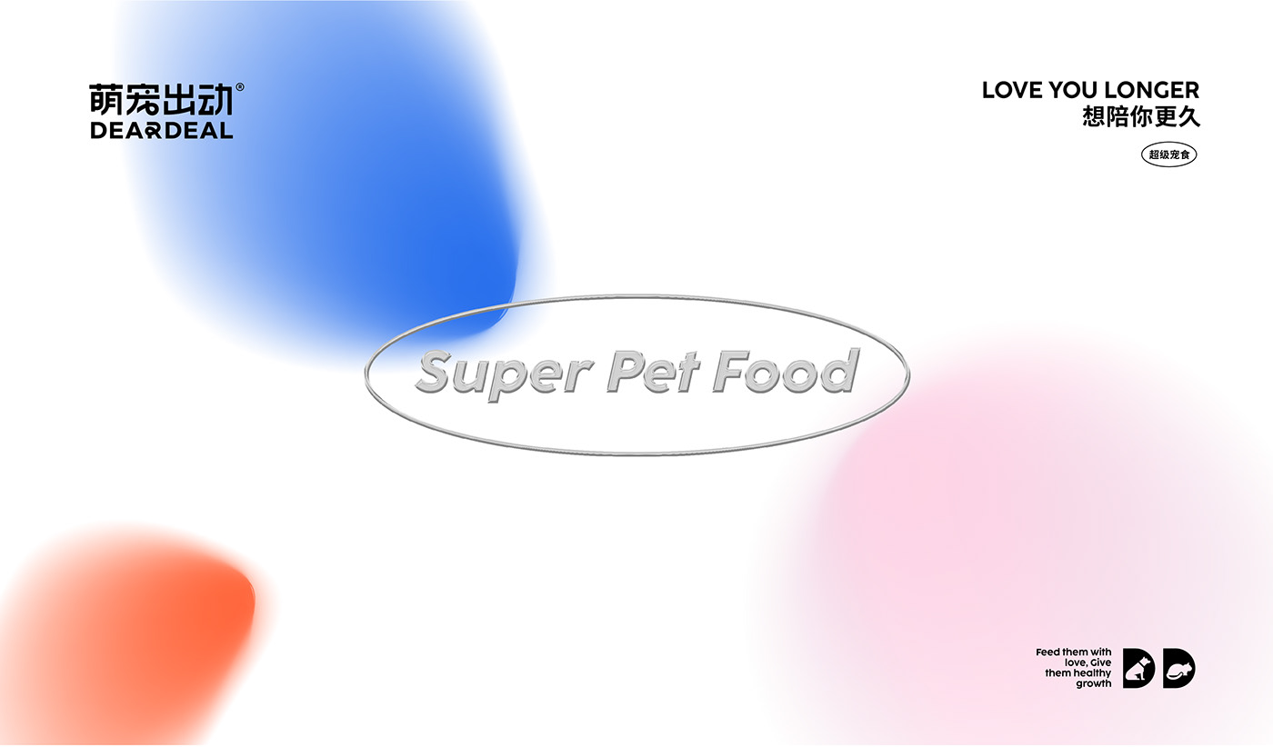
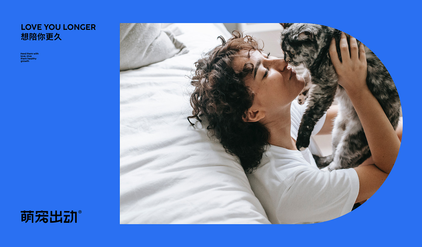
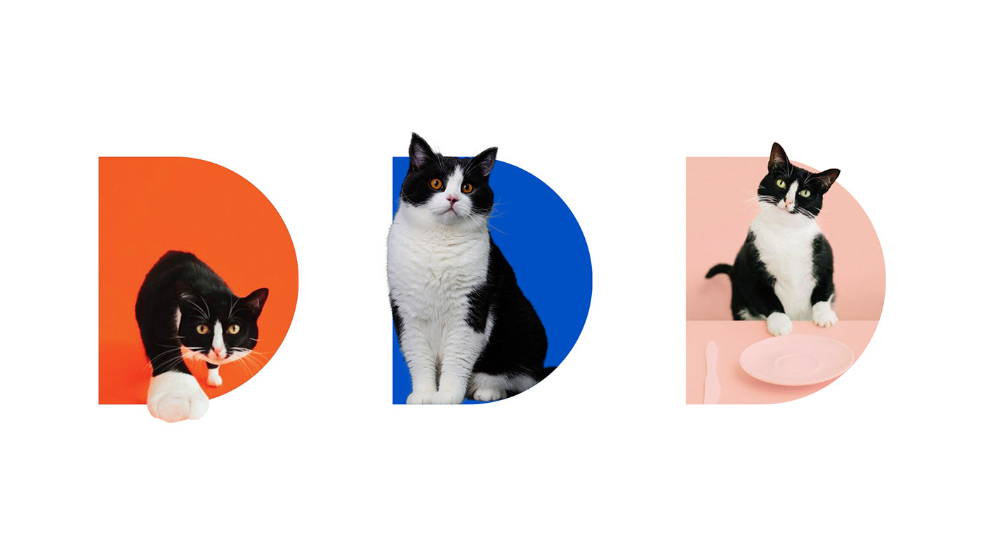
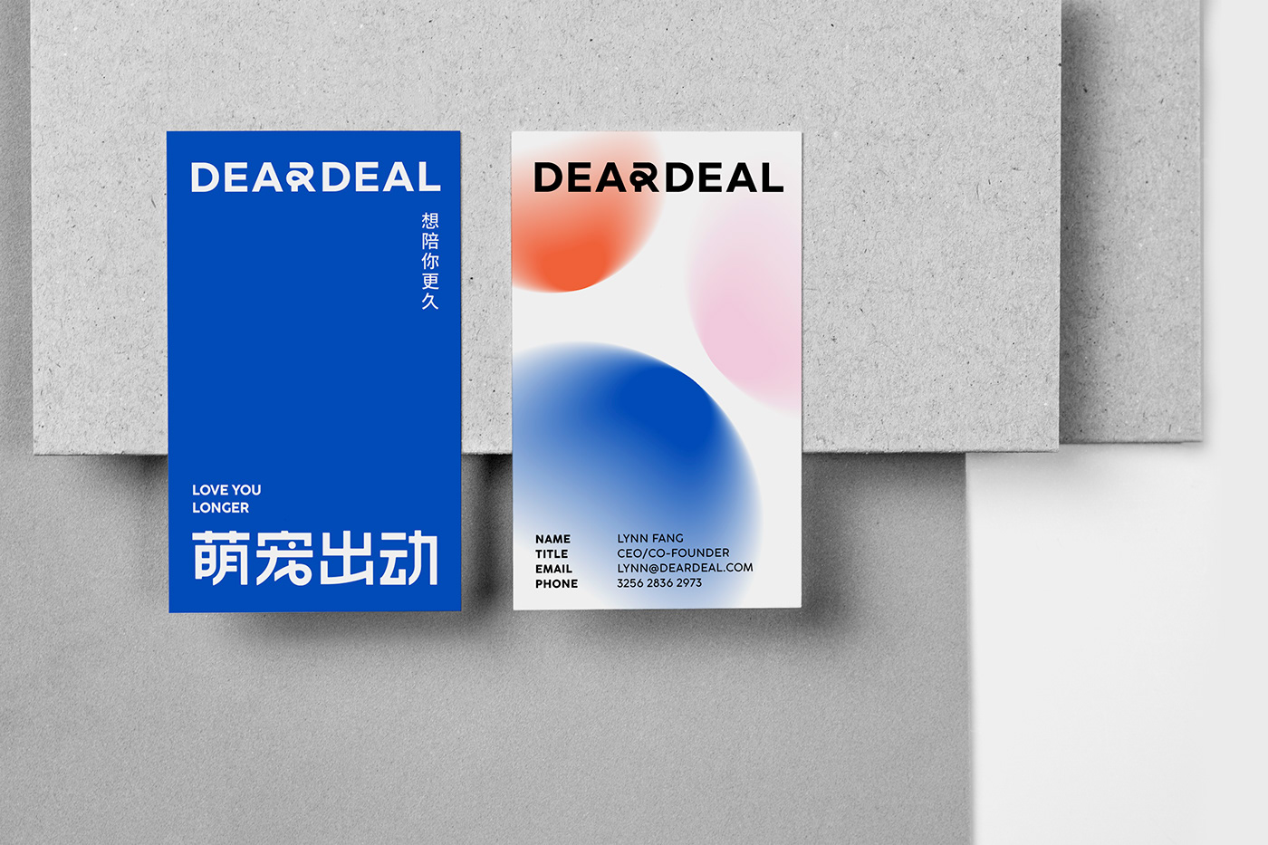
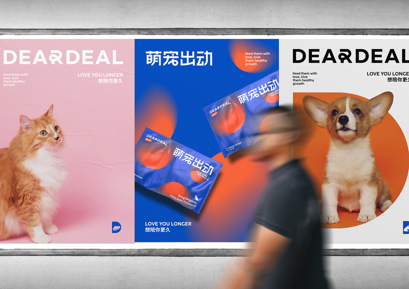
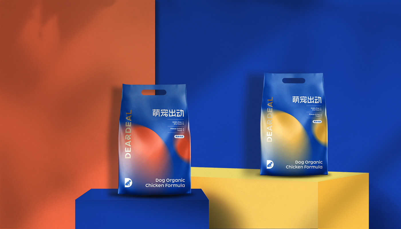
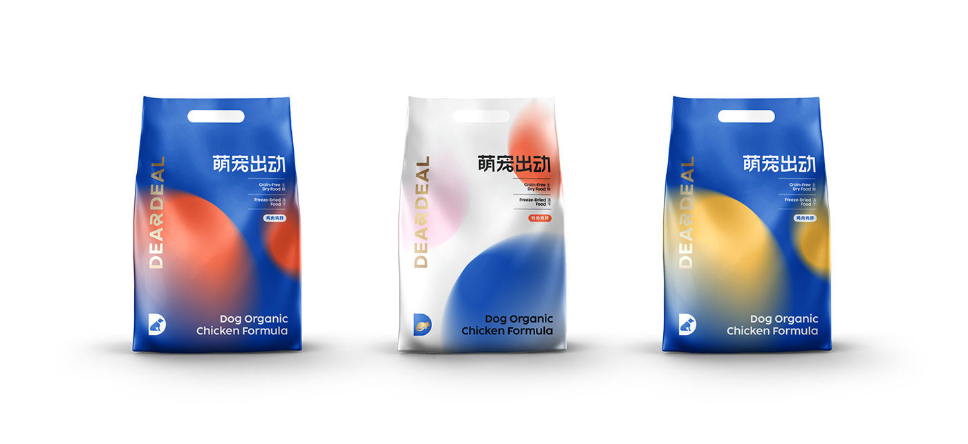
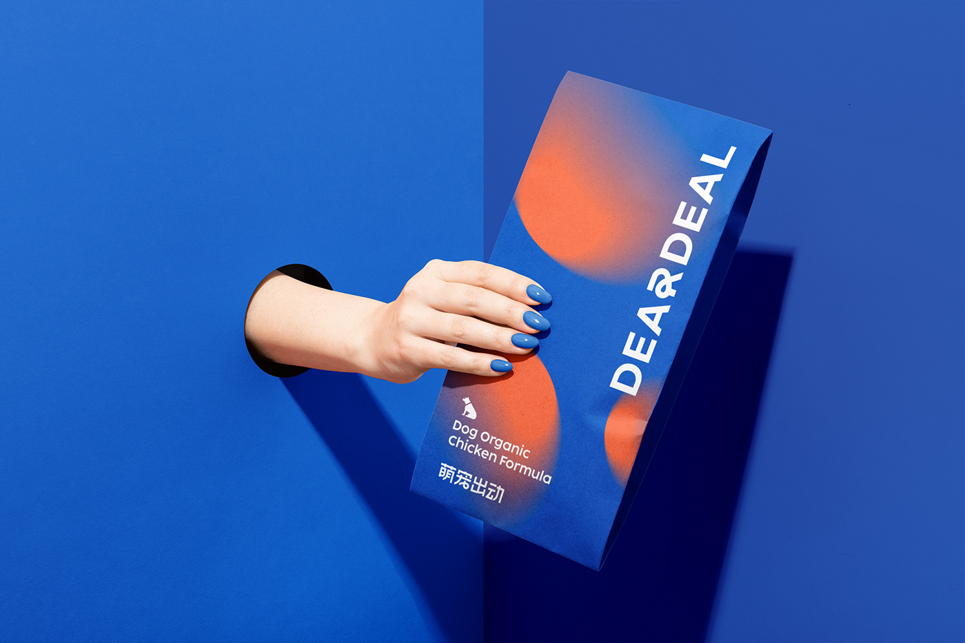
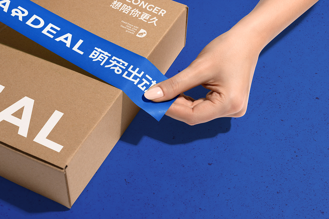
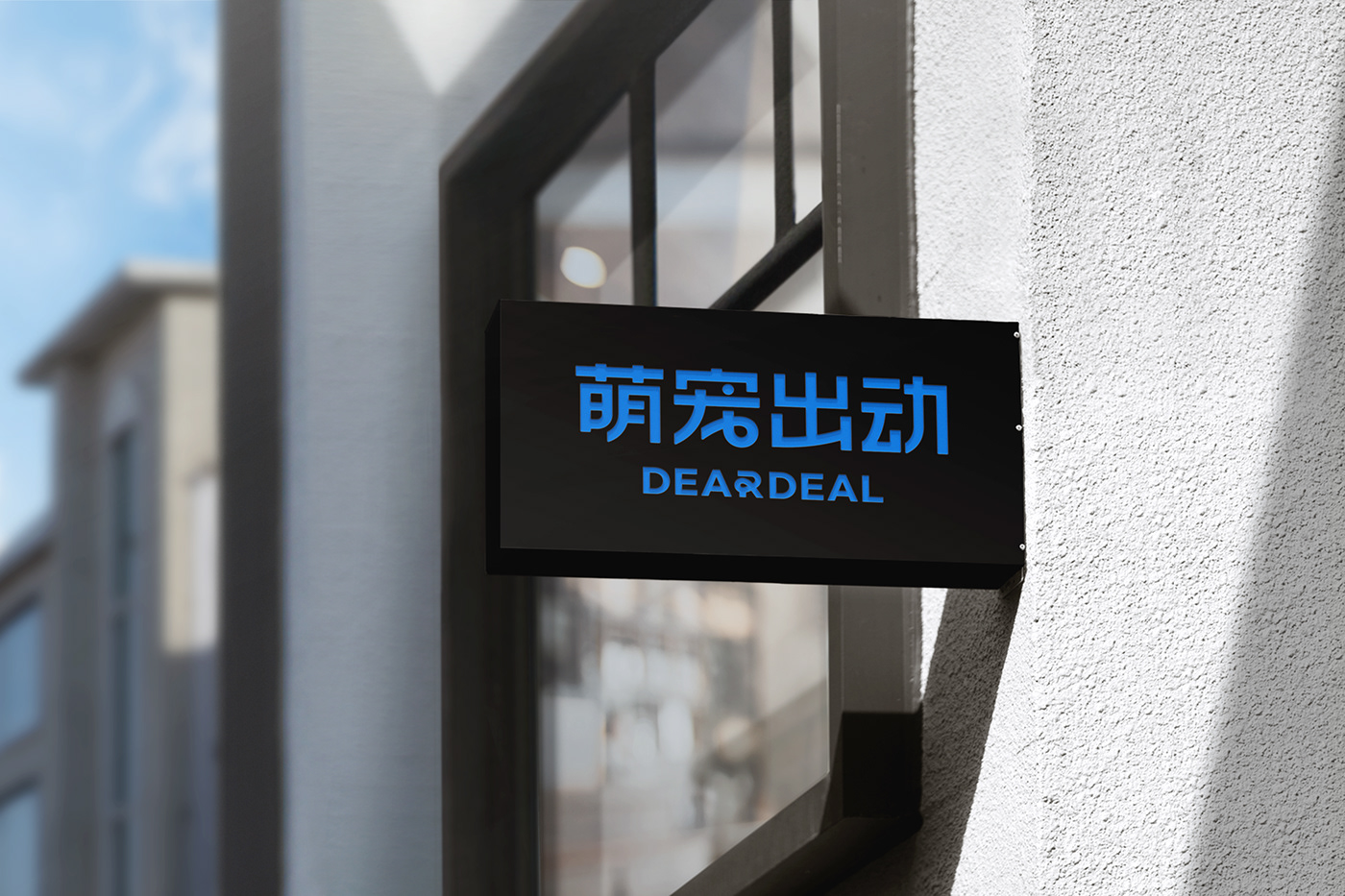
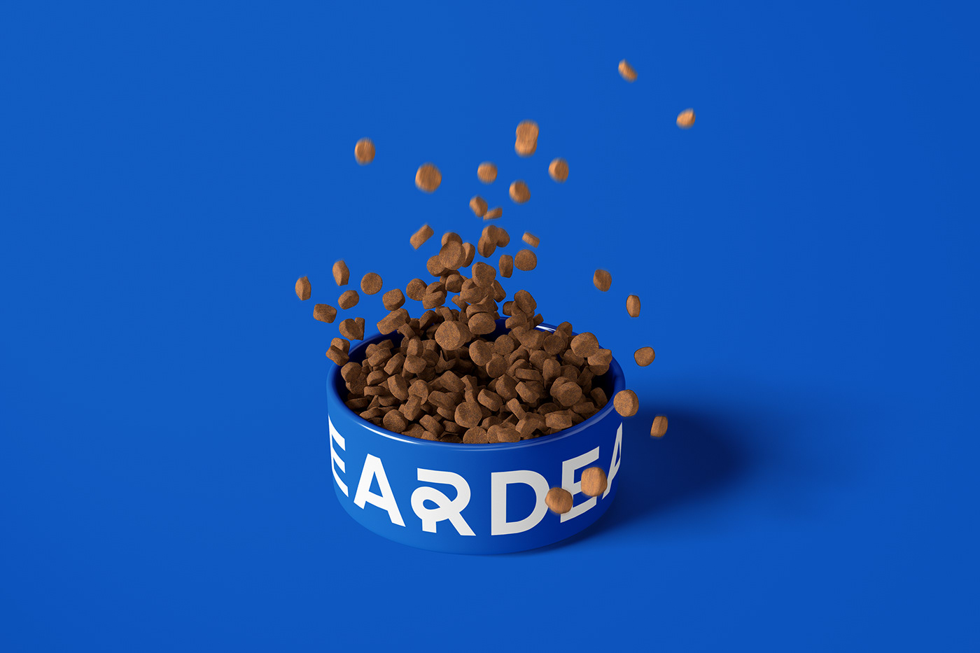
After exploring the pet food market, in order to create a pet food brand with a good outlook, the designer uses sans serif typeface, simple and easy to recognize. The “finger heart” shape is embedded in the logotype design to transform static into dynamic, such nifty and lovely detail shows the brand vigor and the emotional connection between pet and owner. With blue as the main brand color, it also integrates jumping and vigorous color collisions into the brand power to give brand image more buzz-worthy elements, showing brand vigor and innovative awareness to help it promote and develop on the internet smoothly. The VI system continues using the jumping color, and the gradually changing effect is similar with fluffy pets, warm and cute.
Deardeal! Scientific Pet Raising!
Concept&Design / Chelsea Liu
Chinese Logotype / Guohao Yuan
Logo Motion / Wenhui Gao